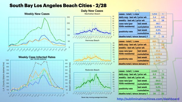
Updated for Sunday, February 28th
New! Daily snapshot covering Manhattan Beach (blue), Hermosa Beach (orange) and Redondo Beach (green). If your primary interest is one of these three communities and you are pressed for time, you may not need to immerse yourself further with the additional charts below.
Another week of modest decreases in new confirmed cases among the beach cities of South Bay Los Angeles. Torrance actually finished the week with more new cases than either of the previous two weeks. In terms of new confirmed cases, it is looking locally like we are nearing a new bottom only slightly lower than the peak of the mid-summer surge.
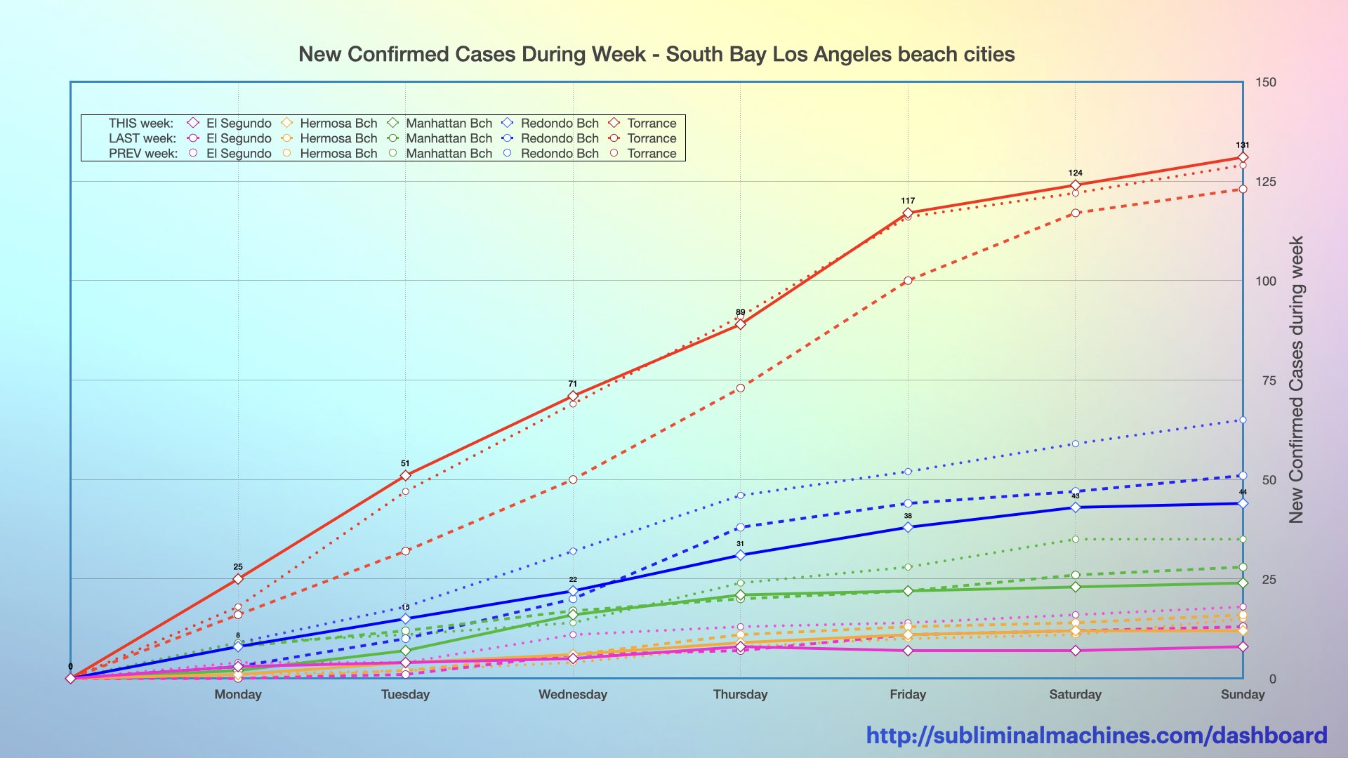
New! Chart showing the increase in confirmed cases over the course of the current week (solid lines), the last week (dashed lines) and the week before that (dotted lines) for each of the local beach cities.
The chart above shows the increases during the week of the new confirmed case counts for each of the local beach cities. These counts don’t take into consideration the different population sizes of the cities. The chart below normalizes each city’s increases to rates per 100,000 residents for more apt comparisons among the cities than just raw counts. From this perspective, less populous cities like El Segundo and Hermosa Beach with relatively fewer new confirmed case counts can have higher (or nearly as high) case rates as Torrance and Redondo Beach even though these more populous cities may have much higher raw counts of new confirmed cases.
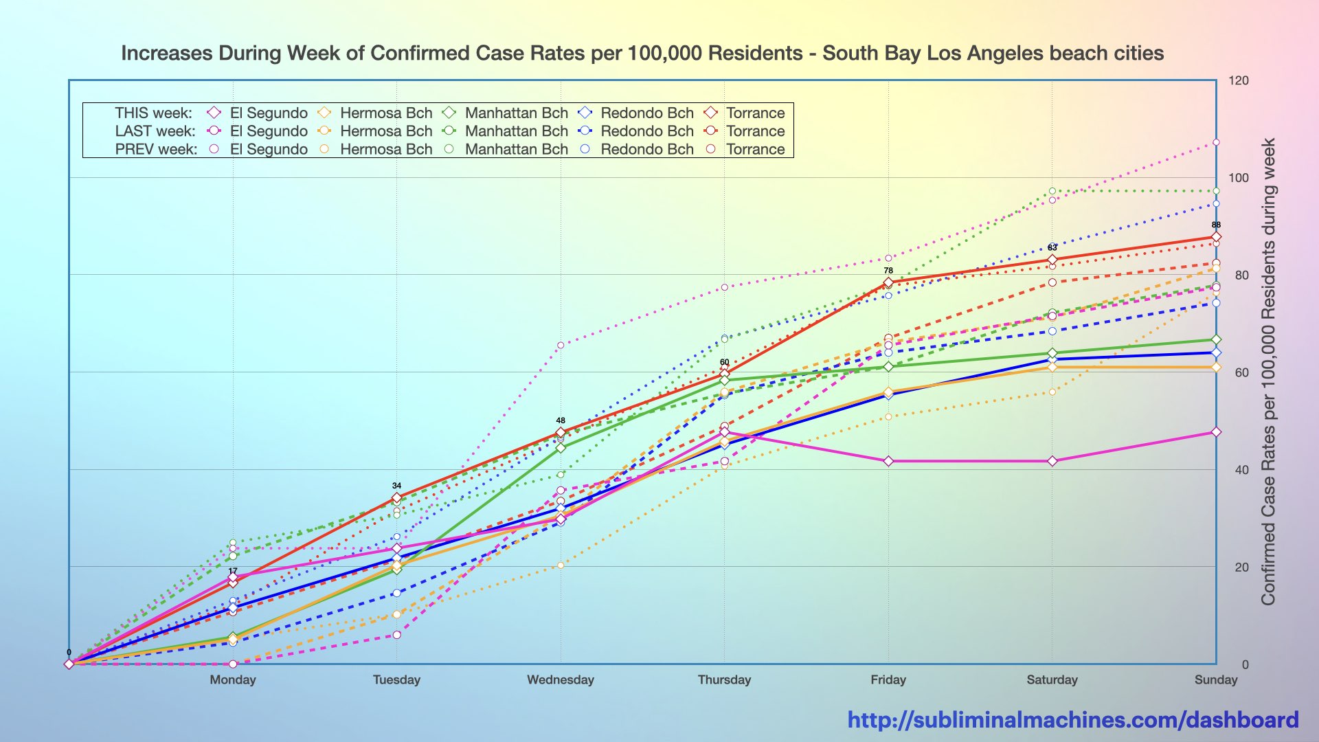
New! Chart showing the increases in the confirmed case rates per 100,000 residents over the course of the current week (solid lines), the last week (dashed lines) and the week before that (dotted lines) for each of the local beach cities.
The chart below shows the raw counts (not rates) of new confirmed cases over the week among the local beach cities considered as a whole against those for Santa Monica and all of Los Angeles County for comparative purposes. Last week, Los Angeles County and Santa Monica again had substantial decreases in new confirmed cases from the prior week while the aggregate for the South Bay beach cities saw a modest decrease of nearly 12%. Five days into the current week, only Los Angeles County has fewer new confirmed cases than at this point of either of the previous two weeks. New confirmed cases in Santa Monica and the aggregate of the South Bay beach cities are higher than at this point last week and below the week prior.
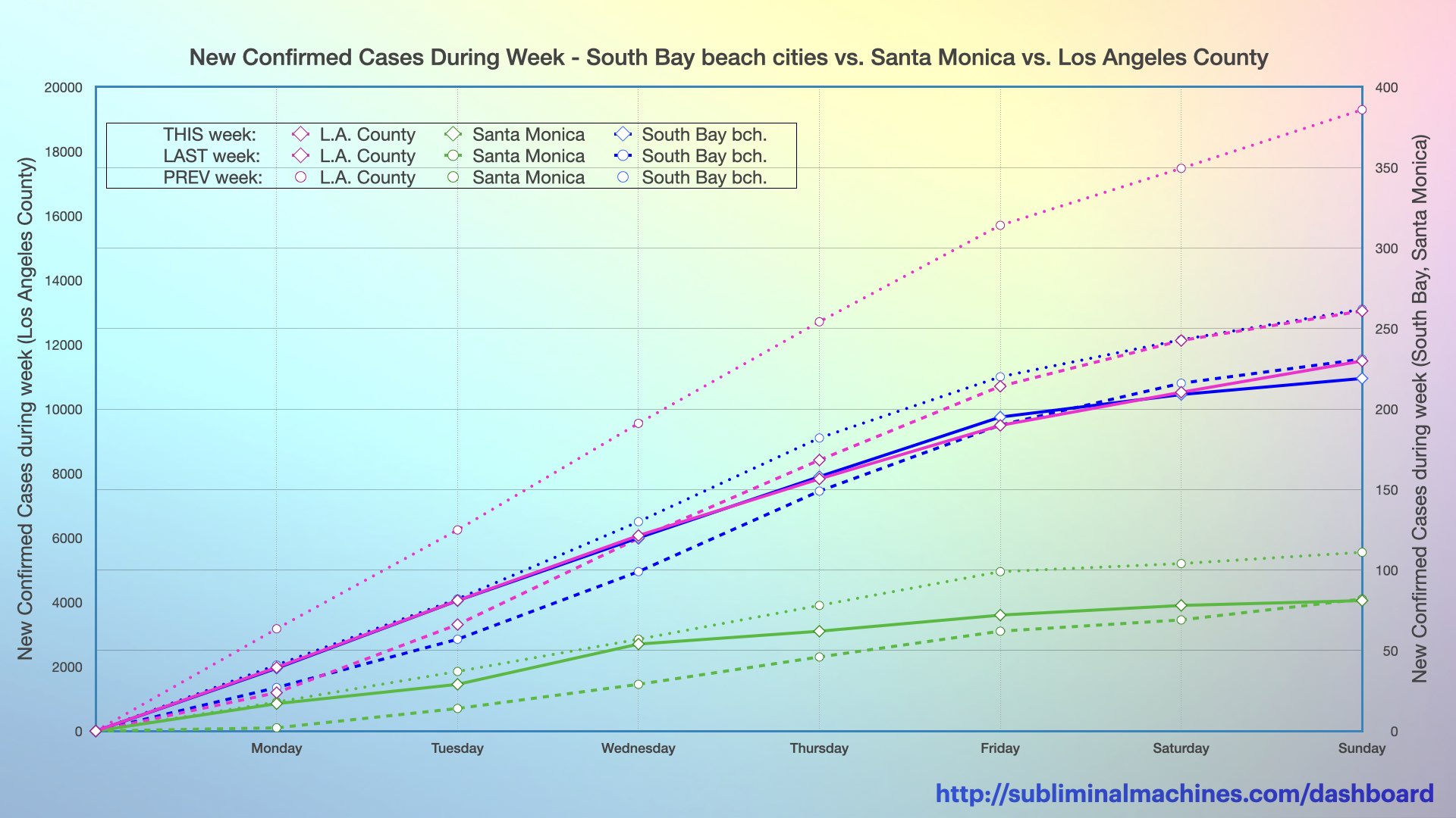
New! Chart showing the increase in confirmed cases over the course of this week (solid lines), the last week (dashed lines) and the prior week before that (dotted lines) for Los Angeles County, the local beach cities considered as an aggregate and Santa Monica (selected for comparison).
This chart below shows the rates (not counts) of new confirmed cases over the week among the local beach cities considered as a whole against those for Santa Monica and all of Los Angeles County for comparative purposes. The confirmed case rate for Los Angeles County is currently trending below either of the two prior weeks. Santa Monica and the local South Bay beach cities are currently above this same point last week.

New! Chart showing the increases in the confirmed case rates per 100,000 residents of the South Bay beach cities, Los Angeles County as a whole and Santa Monica (selected for comparison) over the course of the current week (solid lines), the last week (dashed lines) and the week before that (dotted lines).
The chart below is a timeline showing the weekly number of new confirmed cases in each of the local South Bay beach cities from El Segundo to Torrance and as an aggregate total. The dramatic decreases in new confirmed cases in these cities in recent weeks has mostly levelled. The aggregate total of new confirmed cases in these beach cities is still at approximately the same level as the peak of the summer surge.
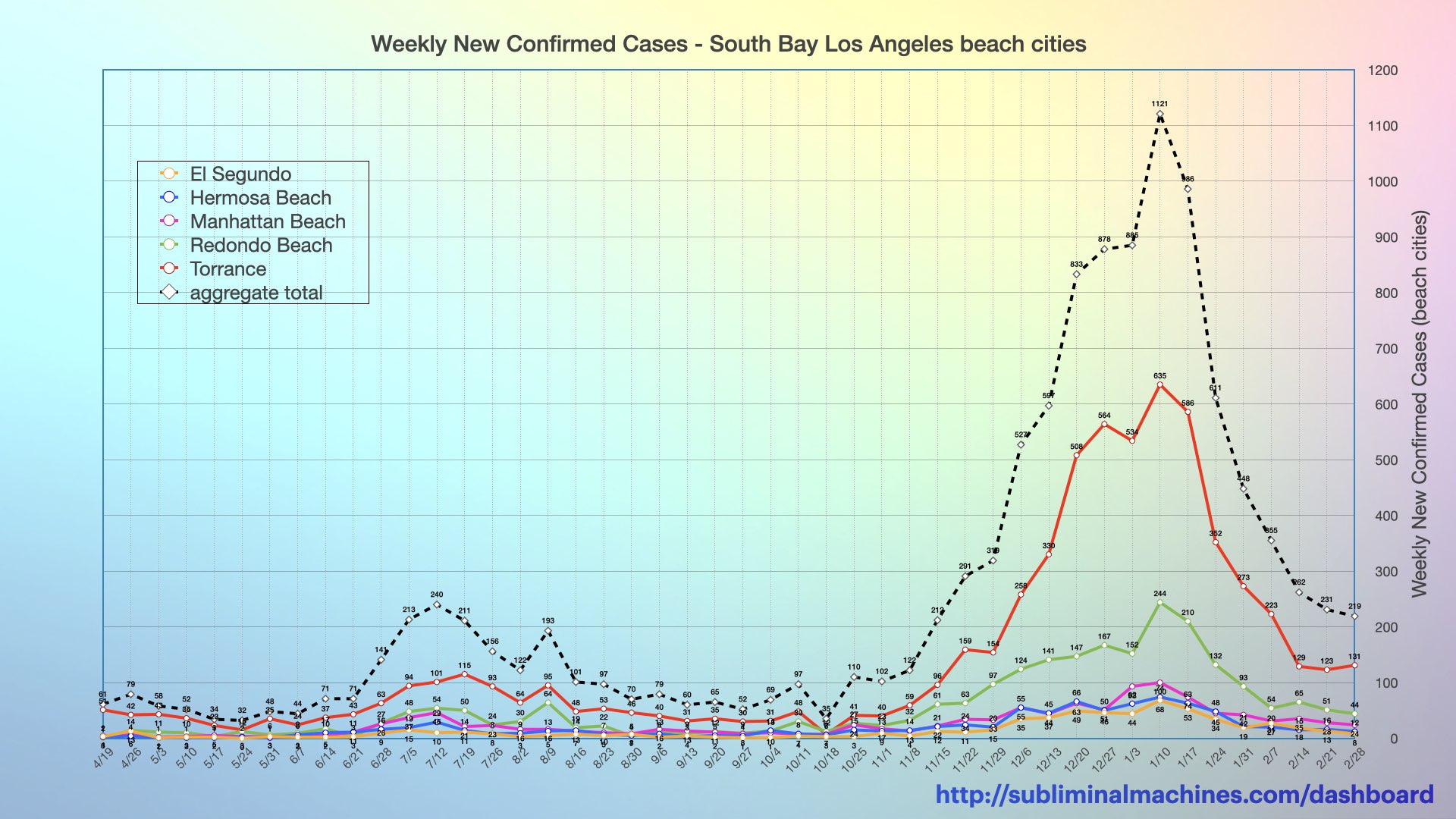
Chart of weekly New Confirmed Cases for El Segundo, Hermosa Beach, Manhattan Beach, Redondo Beach and Torrance (solid coloured lines) as well as the combined total for these cities (dashed black line).
The chart below is a timeline showing the weekly number of new confirmed cases as a rate per 100,000 residents in each of the local South Bay beach cities from El Segundo to Torrance and Los Angeles County considered as a whole. The dotted lines show three week moving average trend lines. All of the areas charted below last week for the third consecutive week.
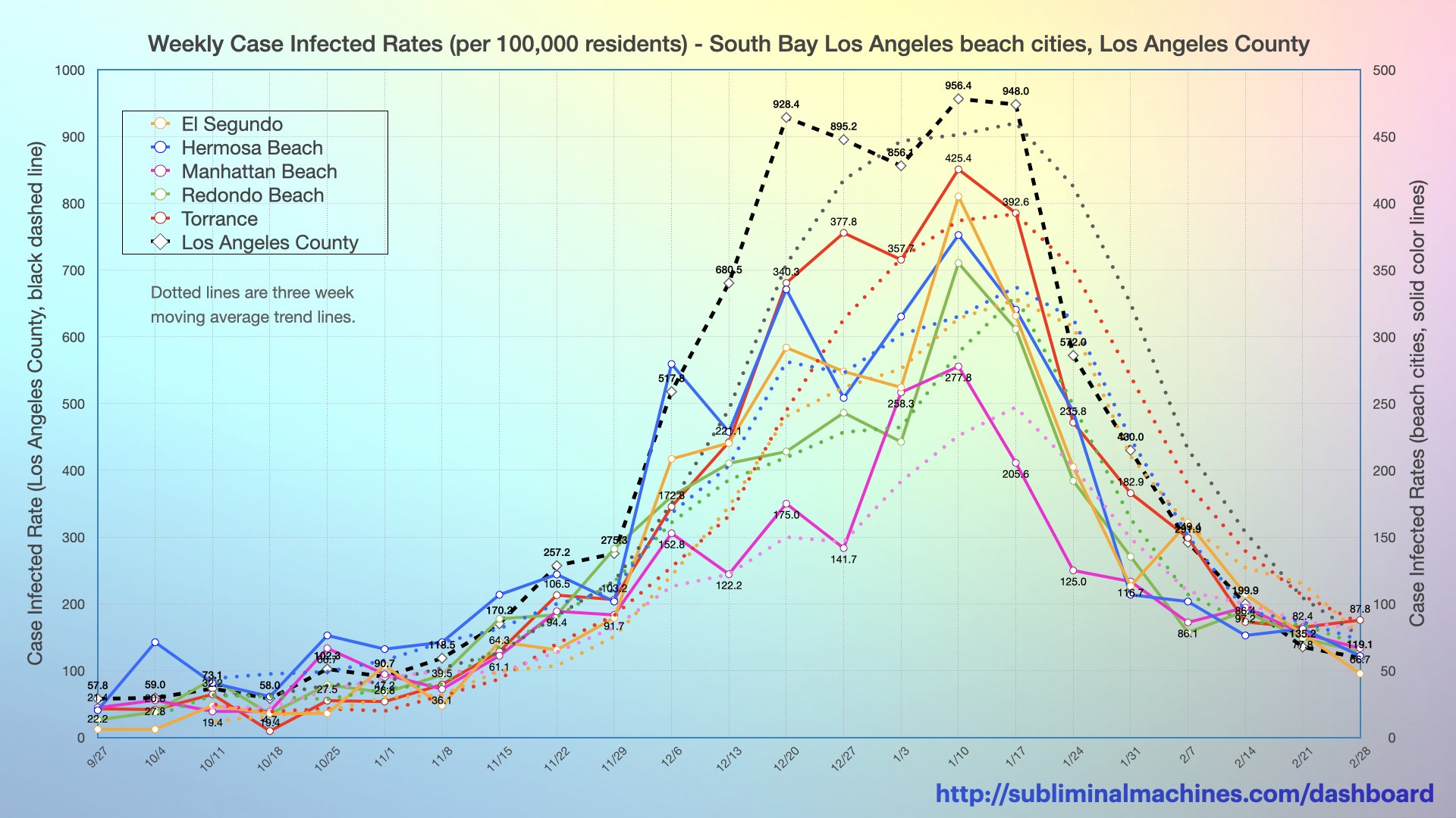
Chart of weekly New Confirmed Cases as rates per 100,000 residents for El Segundo, Hermosa Beach, Manhattan Beach, Redondo Beach and Torrance (solid coloured lines) as well as Los Angeles County as a whole (dashed black line) for comparison.
The number of daily new confirmed cases in both Los Angeles County and the local South Bay beach cities increased alarmingly through November and much of December. Daily case counts in both regions then plateaued at triple the peak of the summer surge. Daily new confirmed cases have decreased substantially since mid-January.
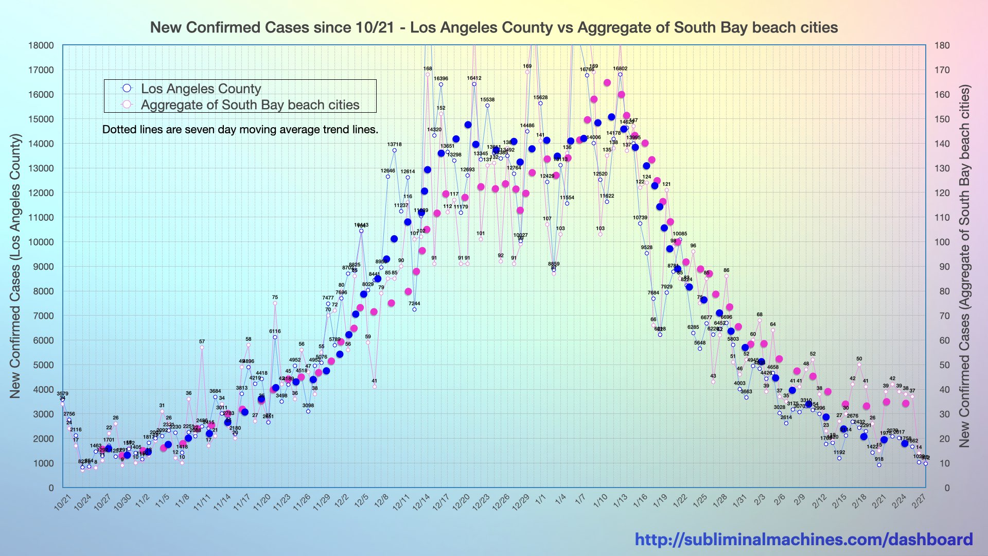
Chart of New Confirmed Cases for Los Angeles County and an aggregate of the combined counts for the beach cities from El Segundo to Torrance.
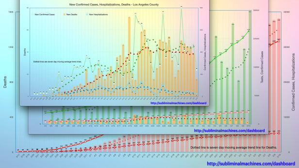
The magenta dotted line in the chart below shows the seven day average of daily new confirmed cases in Los Angeles County. This appears to have reached a peak on December 21st and then plateaued for three weeks before decreasing mid-January. The blue dotted line in the chart below shows the seven day average of daily new hospitalizations. This appears to have sharply increased to a hump peaking December 21st, followed by an even higher hump that peaked on January 2nd and a third hump now peaked as well and decreasing. The seven day average of daily deaths increased gradually across most of the month of December, picked up the pace tracking the current humps of increases in hospitalizations and has now levelled off.
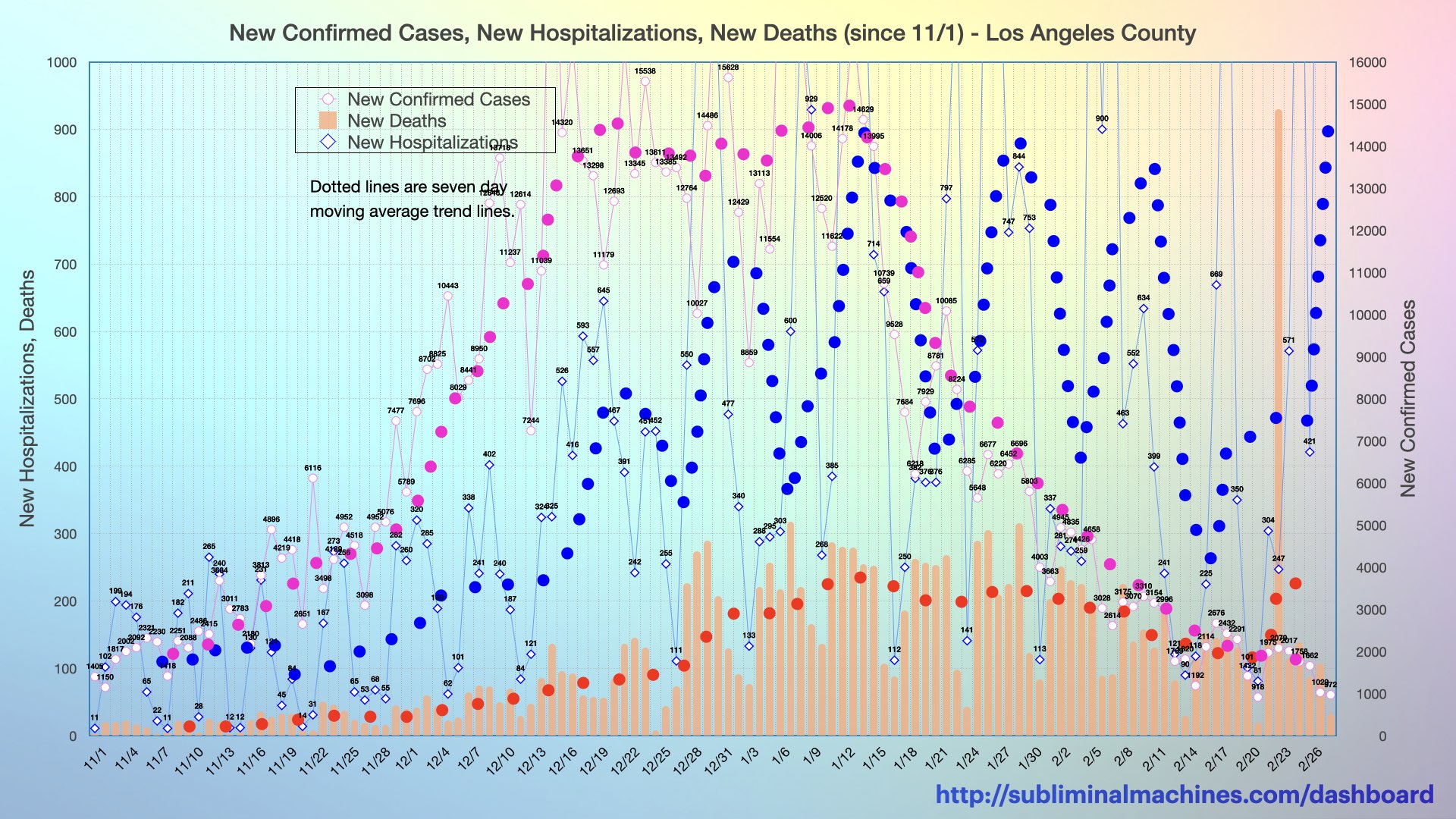
Chart of new Confirmed Cases, Hospitalizations and Deaths (columns) for Los Angeles County as a whole. Trendlines (dotted lines) are seven day moving averages. Read more.
Hospitalizations have increased drastically, growing from 777 at the start of November to a crest of just under 8,100 (a growth of over 900% in ten weeks) but are now on the decline. The number of these patients in the Intensive Care Units of the hospitals in the county increased over seven-fold from 223 to a peak of over 1,700 during this same period.
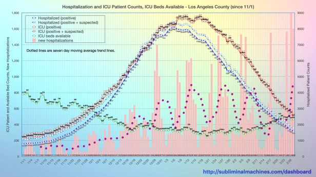
Chart of current COVID-19 hospitalizations (both positive and suspected) along with (both positive and suspected) patient counts in the ICU (Intensive Care Units) and available ICU beds (counts and percentage of total). Read more.
At the local South Bay hospitals, the number of patients who have tested positive significantly increased (by multiples) from the beginning of November but have now begun to decrease gradually. The number of these patients in the Intensive Care Units also increased substantially, reducing in turn, the quantity of ICU beds available.
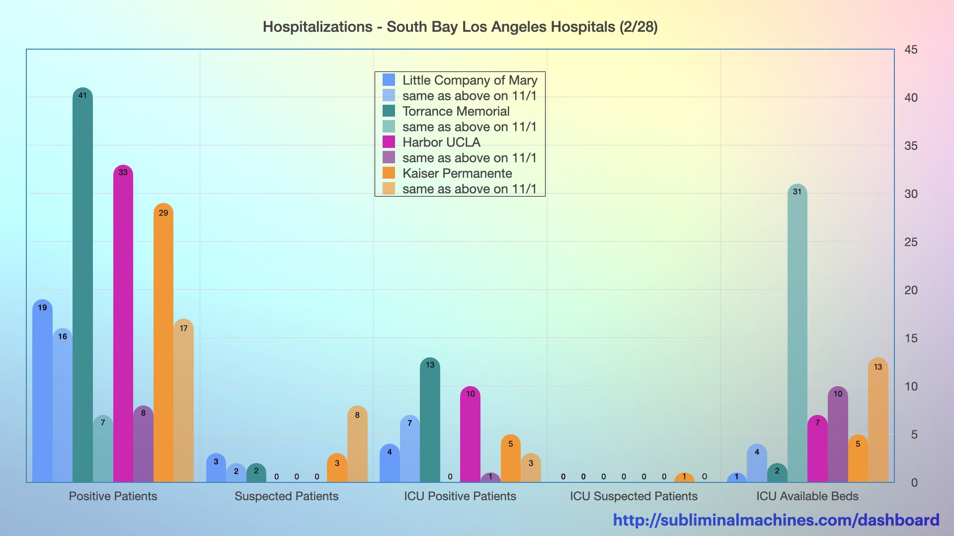
Chart showing the counts of Positive Patients, Suspected Patients, ICU Patients (both positive and suspected) and ICU Available Beds at the local South Bay Los Angeles Hospitals.
The chart below is similar to the one above except that it contrasts the current activity at the local South Bay hospitals with that at the peak of the recent surge on January 9th. The number of patients who have tested positive has decreased in the interim but the number of these patients in the Intensive Care Units nor the quantity of available ICU beds has changed substantially.
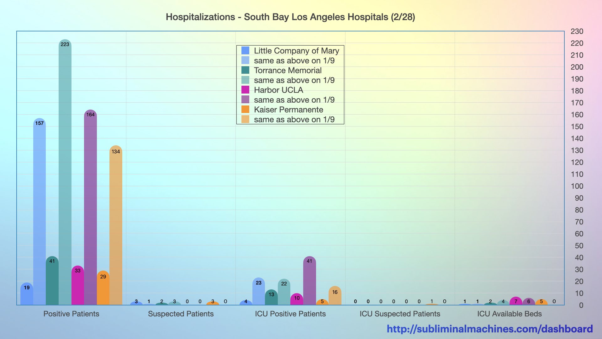
Chart showing the counts of Positive Patients, Suspected Patients, ICU Patients (both positive and suspected) and ICU Available Beds at the local South Bay Los Angeles Hospitals.
The counts of positive tested patients at the local South Bay hospitals (dotted lines) steadily increased through the end of last year but have now begun to decrease back down. The general increase in positive tested ICU patients (solid lines) and decrease in available ICU beds (dashed lines) can also be discerned in this timeline.
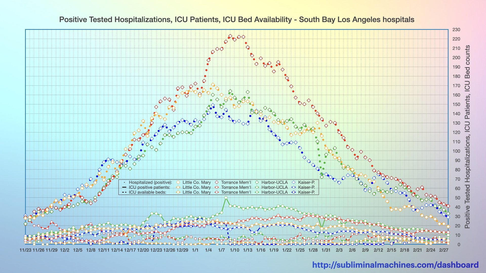
New! Chart showing the timeline of daily counts of Positive Patients (dotted lines), Positive ICU Patients (solid lines) and ICU Available Beds (dashed lines) at the local South Bay Los Angeles Hospitals.
Looking into the data for the local South Bay hospitals more closely, the chart below shows a timeline of the 7-day averages of Staffed Adult ICU beds (dashed lines) at each facility, those occupied (solid lines) and the resulting percent occupancy (dotted lines scaled vertically on left axis). Most notably in this chart, the Staffed Adult ICU bed occupancy percentage at Kaiser Permanente – South Bay reached a low in mid/late September before increasing steadily through November.
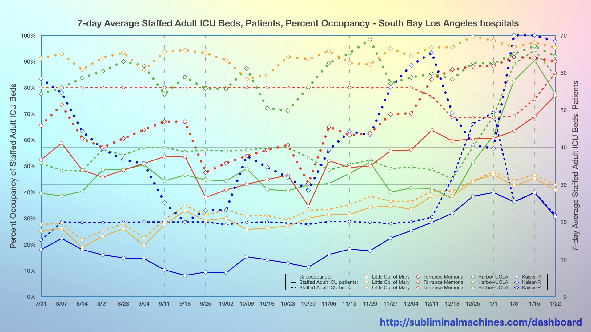
New! Chart showing the timeline of 7-day averages of Staffed Adult ICU beds (dashed lines), Staffed Adult ICU Occupancy (solid lines) and the resulting Staffed Adult ICU Occupancy as a Percentage (dotted lines) at the local South Bay Los Angeles Hospitals.
The chart below shows a timeline of the percentages of total confirmed and suspected (adult) patients in the Adult ICU (dotted lines), in Adult Beds (solid lines) and among all Adult Patients (dashed lines) at each of the local South Bay hospitals. Most notably in this chart, the percentages of Adult COVID-19 patients (both confirmed and suspected) in the Adult ICUs at Little Company of Mary, Harbor-UCLA and Kaiser Permanente – South Bay hospitals all rise dramatically through November and into December.

New! Chart showing the timeline of the percentages of total confirmed and suspected (adult) patients in the Adult ICU (dotted lines), in Adult beds (solid lines) and among all Adult Patients (dashed lines) at each of the local South Bay Los Angeles Hospitals.
The chart below takes a different view of the activity at the local South Bay hospitals. It shows a timeline of the 7-day sums of All Emergency Department Visits (dotted lines scaled vertically on left axis) at each facility, the subset of COVID-19 Emergency Department Visits (solid lines) and COVID-19 Adult Admissions (dotted lines). Most notably in this chart, the COVID-19 Emergency Department Visits at Kaiser Permanente – South Bay reach a low in mid September, steadily increases through October and then takes off from mid-November on.

New! Chart showing the timeline of 7-day sums of All Emergency Department Visits (dotted lines), COVID-19 Emergency Department Visits (solid lines) and COVID-19 Adult Admissions (dashed lines) at the local South Bay Los Angeles Hospitals.
With only 3.0% of the country’s population, Los Angeles County has 4.3% of the country’s cases over the past seven days, making us the top ranked county in the entire country according to the White House COVID-19 Task Force. The county’s share of the national cases has decreased from 6.3% last month.
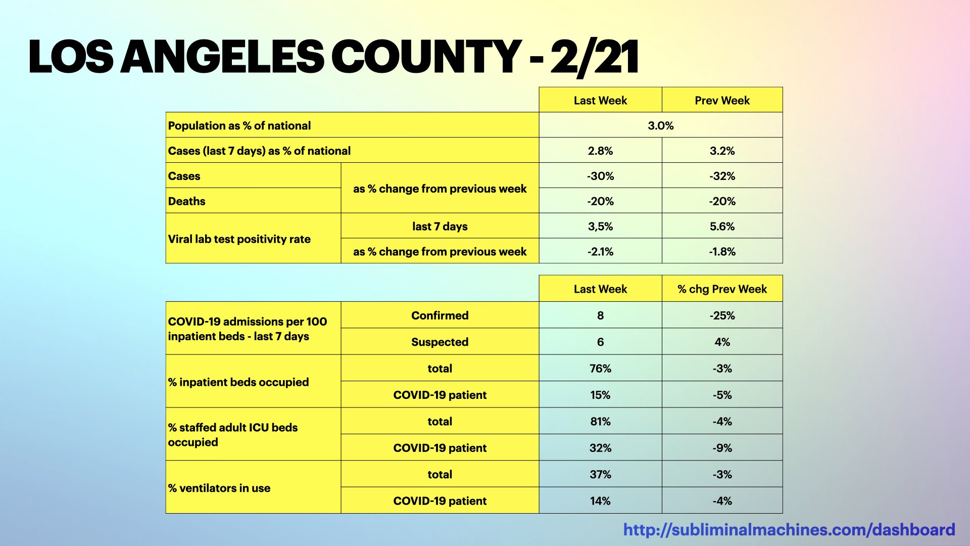
New! Selected data snapshot for Los Angeles County from White House COVID-19 Task Force.
The effective reproduction number (R-effective) is the average number of people each infected person is estimated to pass the virus onto and represents the rate at which infection is spreading. The estimate of R-effective shown for Los Angeles County has decreased to 0.74 which means infection is likely decreasing.

Chart of R-effective Spread Trends modelled for Los Angeles County as a whole. The heavier red line represents a composite trendline of several models including some not individually charted here for purposes of clarity.
Below, are three charts showing what the California Department of Public Health has forecast for Los Angeles County over the next month. While the number of positive tested patients hospitalized and receiving intensive care are both forecast to decrease, deaths will continue to increase.

This chart of positive tested patient counts in Los Angeles County hospitals shows we are currently in the third (and highest) wave of hospitalizations. How accurate were the forecasts from November about the current hospitalization levels? We looked into this here.

New! Chart of COVID-19 Hospitalized Patient Counts in Los Angeles County along with modelled estimates and forecasts. The heavier red dashed line represents a composite trendline of several models including some not individually charted here for purposes of clarity.
The chart below shows the cumulative count of COVID-19 patients in Los Angeles County hospitals along with estimated and forecast models.

New! Chart of COVID-19 patients in the ICUs of Los Angeles County hospitals along with modelled estimates and forecasts. The heavier red dashed line represents a composite trendline of several models including some not individually charted here for purposes of clarity.
The chart below shows the cumulative count of COVID-19 deaths in Los Angeles County hospitals along with estimated and forecast models.
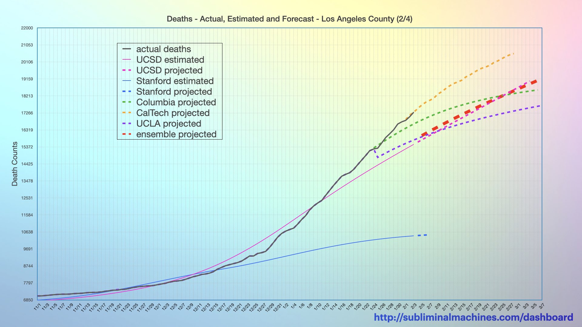
New! Chart of cumulative COVID-19 death counts in Los Angeles County along with modelled estimates and forecasts. The heavier red dashed line represents a composite trendline of several models including some not individually charted here for purposes of clarity.
These are the most recently updated charts since the versions that were published in the Weekly Summary for the South Bay beach cities. There are more charts available to view there for a more complete picture.
see more…

See all charts for the South Bay Los Angeles beach cities showing Testing, Confirmed Cases, Hospitalizations and Deaths for the county as a whole.
See charts for Los Angeles County showing Testing, Confirmed Cases, Hospitalizations and Deaths for the county as a whole.

More charts showing demographics distributions by Age Group, Underlying Conditions, Ethnicity, Income and Gender for Los Angeles County as a whole.
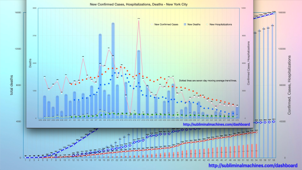
How is Los Angeles County doing relative to New York City? See the comparison charts between Los Angeles County and New York City.

Thanks for looking.
Check back tomorrow
for the latest updates.
Get in Touch…
You can send Subliminal Machines a private message by selecting Contact in the menu at the top of this page or just post a comment below.
Copyright Subliminal Machines – All rights reserved
