Updated through Sunday, February 21st
Note! See the latest updates to some of these charts for an inter-week preview of the current situation.

The weekly summary features scorecards that snapshot how each of the South Bay Los Angeles beach cities are doing. Alternatively, you can review the charts below in detail at your own pace. There is a separate weekly summary that snapshots Los Angeles County as a whole.

Chart of Weekly New Confirmed Cases for El Segundo, Hermosa Beach, Manhattan Beach, Redondo Beach and Torrance (solid coloured lines) as well as the combined total for these cities (dashed dark gray line).

Chart of Weekly New Confirmed Cases for Palos Verdes Estates, Rancho Palos Verdes, Rolling Hills and Rolling Hills Estates (solid coloured lines) as well as the combined total for these cities (dashed dark gray line).

Chart showing the increase in confirmed cases over the course of last week (solid lines), the prior week (dashed lines) and the week before that (dotted lines) for each of the local beach cities.

Chart showing the increases in the confirmed case rates per 100,000 residents over the course of the current week (solid lines), the last week (dashed lines) and the week before that (dotted lines) for each of the local beach cities.

Chart showing the increase in confirmed cases over the course of last week (solid lines), the prior week (dashed lines) and the week before that (dotted lines) for Los Angeles County, the local beach cities considered as an aggregate and Santa Monica (selected for comparison).

New! Chart showing the increases in the confirmed case rates per 100,000 residents of the South Bay beach cities, Los Angeles County as a whole and Santa Monica (selected for comparison) over the course of the current week (solid lines), the last week (dashed lines) and the week before that (dotted lines).

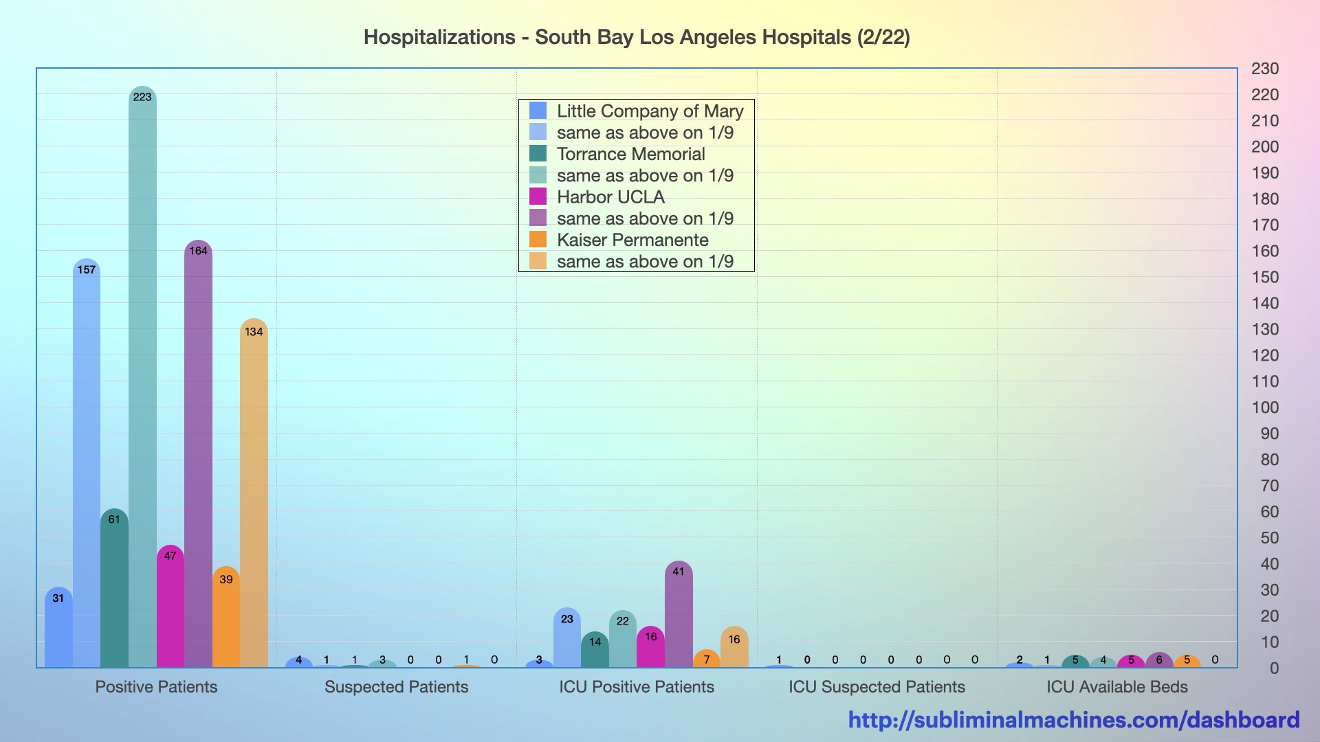
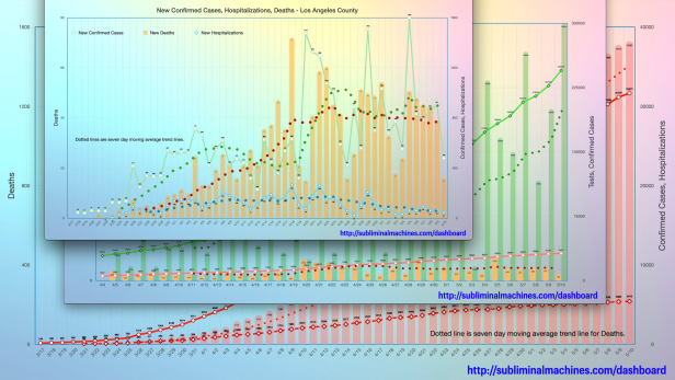
Chart showing the counts of Positive Patients, Suspected Patients, ICU Patients and ICU Available Beds at the local South Bay Los Angeles Hospitals, current vs start of surge in hospitalizations.
New! Chart showing the counts of Positive Patients, Suspected Patients, ICU Patients (both positive and suspected) and ICU Available Beds at the local South Bay Los Angeles Hospitals, current vs peak of surge in hospitalizations.
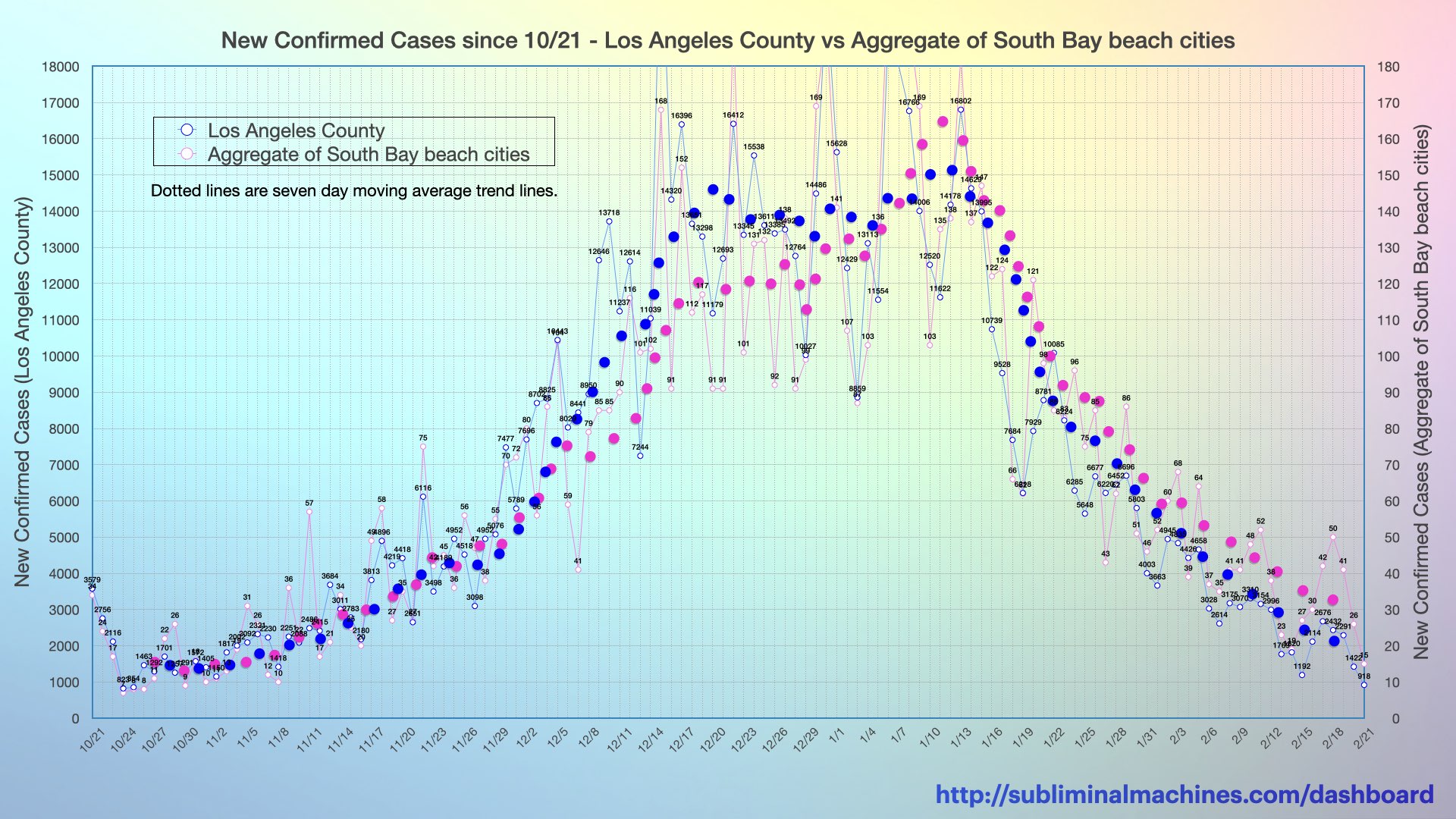
New! Chart of New Confirmed Cases for Los Angeles County and an aggregate of the combined counts for the beach cities from El Segundo to Torrance.
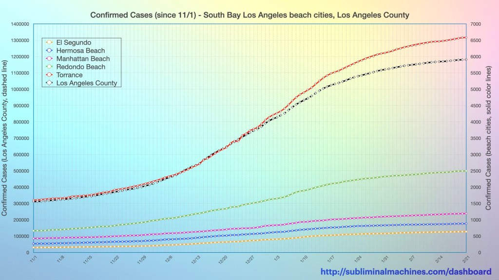
Chart of Confirmed Cases (cumulative) for El Segundo, Hermosa Beach, Manhattan Beach, Redondo Beach and Torrance (solid lines in colour, right scale), as well as all of L.A. County (dashed grey line, left scale). Read more.
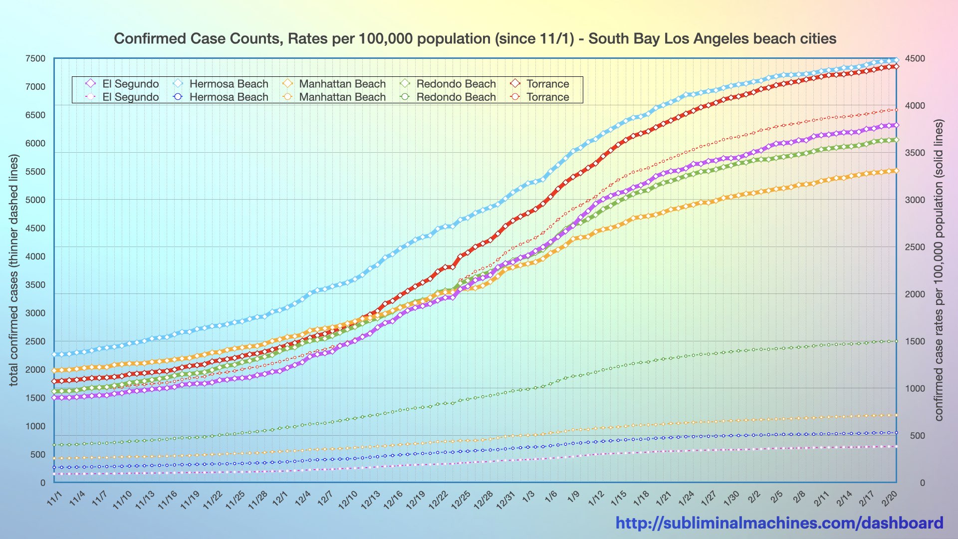
Chart of Confirmed Cases for El Segundo, Hermosa Beach, Manhattan Beach, Redondo Beach and Torrance (solid lines in colour, right scale) expressed per 100,000 people to account for different population sizes.

Chart of the count of Persons who tested positive in the local South Bay cities over the previous seven days (left). Chart of the positivity rates of these same tests (right). Both charts proportionally scale the diameter of the circles to each city’s seven day case counts and percentages.

Chart of the cumulative count of Persons who tested positive in the local South Bay cities (left). The chart on the right shows the same but normalized with each city’s population and expressed as a rate per 100,000 residents. Both charts proportionally scale the diameter of the circles to each city’s counts and rates.
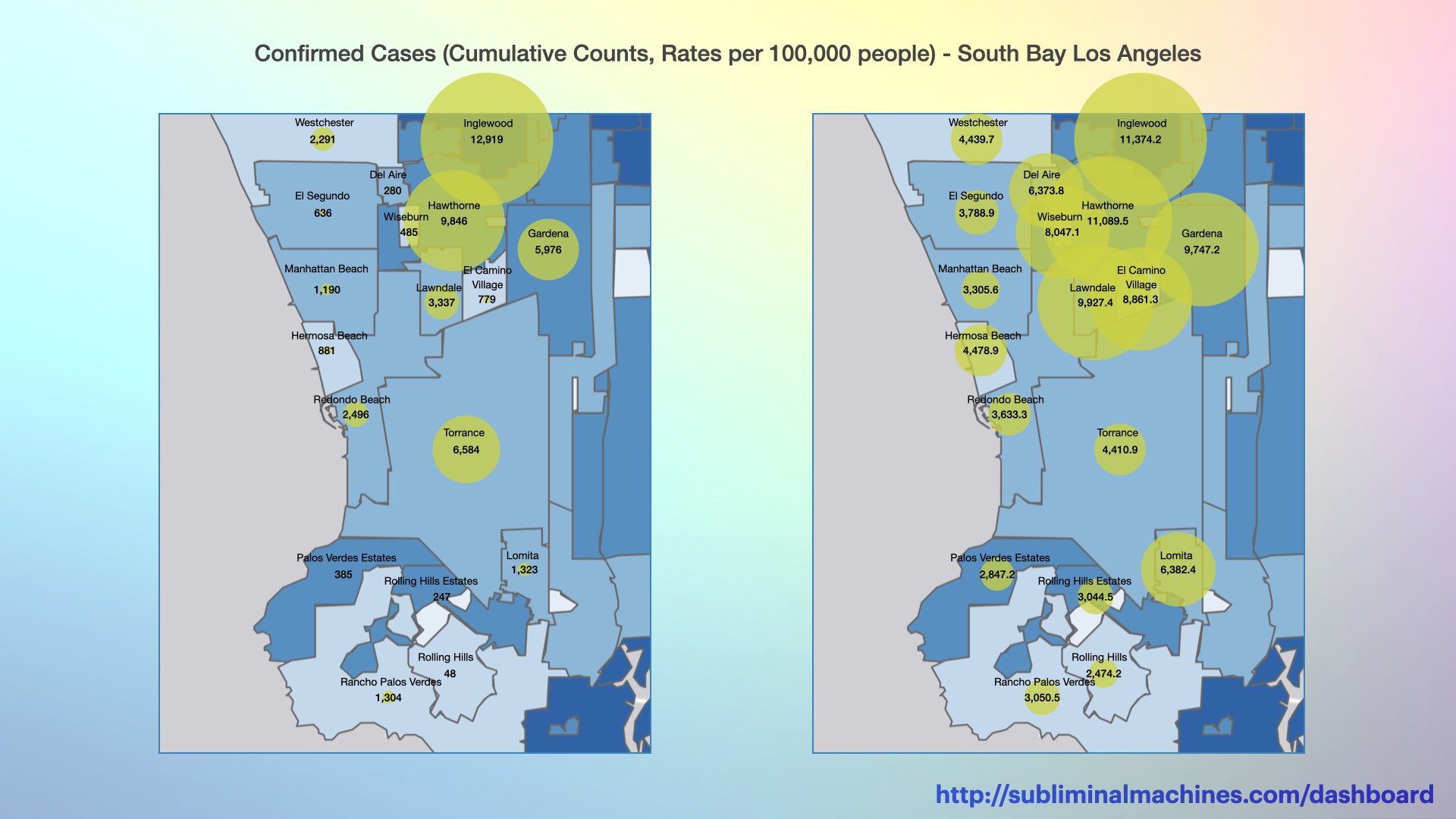
Charts of Confirmed Cases in local South Bay Los Angeles cities. The chart on the left shows the count per city, proportionally scaling the diameter of the circles. The chart on the right shows the same but normalized with each city’s population and expressed as a rate per 100,000 people.

Charts of Deaths in local South Bay Los Angeles cities. The chart on the left shows the count per city, proportionally scaling the diameter of the circles. The chart on the right shows the same but normalized with each city’s population and expressed as a rate per 100,000 people.
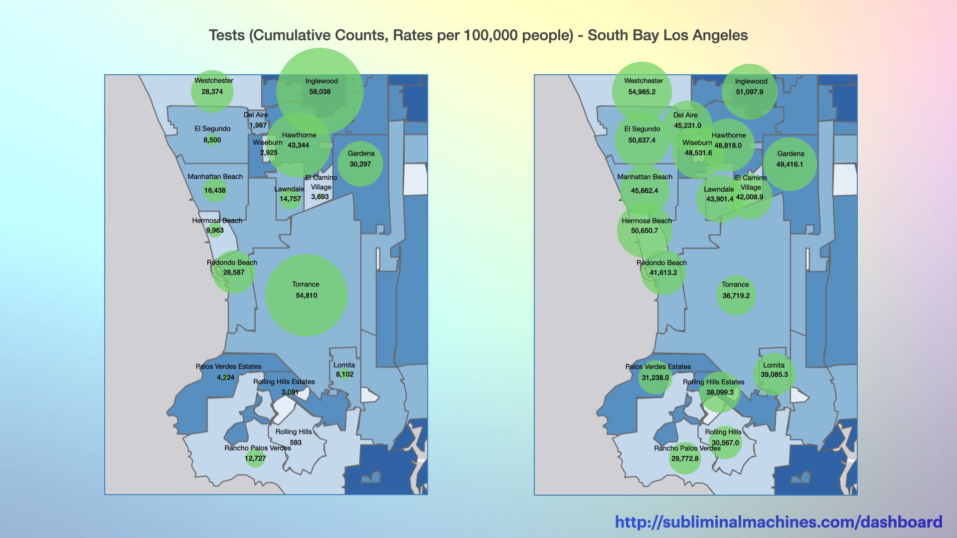
Charts of Testing in local South Bay Los Angeles cities. The chart on the left shows the count per city, proportionally scaling the diameter of the circles. The chart on the right shows the same but normalized with each city’s population and expressed as a rate per 100,000 people.
Please note: the four pairs of bubble charts below reflect the data as posted Friday afternoon. The county public health department has not updated the numbers underlying these charts since then.
see more…
See charts for Los Angeles County showing Testing, Confirmed Cases, Hospitalizations and Deaths for the county as a whole.

More charts showing demographics distributions by Age Group, Underlying Conditions, Ethnicity, Income and Gender for Los Angeles County as a whole.
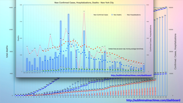
How is Los Angeles County doing relative to New York City? See the comparison charts between Los Angeles County and New York City.

Thanks for looking.
Check back tomorrow
for the latest updates.
Get in Touch…
You can send Subliminal Machines a private message by selecting Contact in the menu at the top of this page or just post a comment below.
Copyright Subliminal Machines – All rights reserved

Could you use a larger font on the y-axis? Also on the legend boxes?
Check out the print edition of the Easy Reader. Your stuff is illegible. Also, when printing labels on the x-axis, red and black have printed over each other, and smeared, and it is also illegible. But thank you for compiling this data.
LikeLike
hello Holly, thanks for looking and thanks for the suggestion!
LikeLike