Updated thru Sunday, February 21st
See the weekly summary for a curated collection of the most essential charts for Los Angeles county. Additional and extraneous charts are available below for completists.

New! California Department of Public Health forecasts of hospitalizations and deaths for Los Angeles County through this month.

New! Chart of R-effective Spread Trends modelled for Los Angeles County as a whole. The heavier red line represents a composite trendline of several models including some not individually charted here for purposes of clarity.

New! Chart of COVID-19 Hospitalized Patient Counts in Los Angeles County along with modelled estimates and forecasts. The heavier red dashed line represents a composite trendline of several models including some not individually charted here for purposes of clarity.

New! Chart of COVID-19 patients in the ICUs of Los Angeles County hospitals along with modelled estimates and forecasts. The heavier red dashed line represents a composite trendline of several models including some not individually charted here for purposes of clarity.
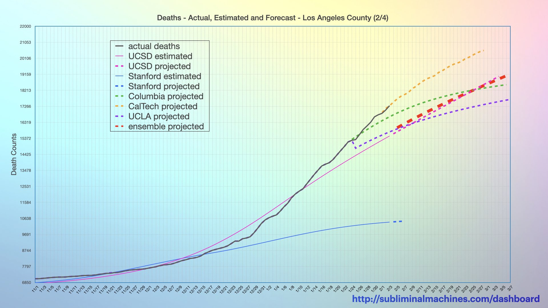
New! Chart of cumulative COVID-19 Deaths in Los Angeles County along with modelled estimates and forecasts. The heavier red dashed line represents a composite trendline of several models including some not individually charted here for purposes of clarity.
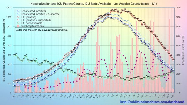
Chart of current COVID-19 hospitalizations (both positive and suspected) along with (both positive and suspected) patient counts in the ICU (Intensive Care Units) and available ICU beds. Read more.
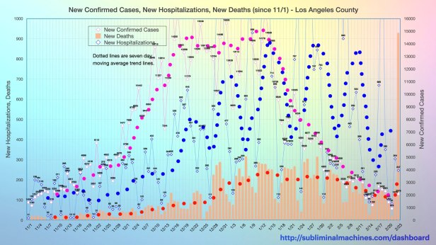
Chart of new Confirmed Cases, Hospitalizations and Deaths (columns) for Los Angeles County as a whole. Trendlines (dotted lines) are seven day moving averages. Read more.

Chart of cumulative Confirmed Cases, Hospitalizations and Deaths (columns) for L.A. County as a whole.
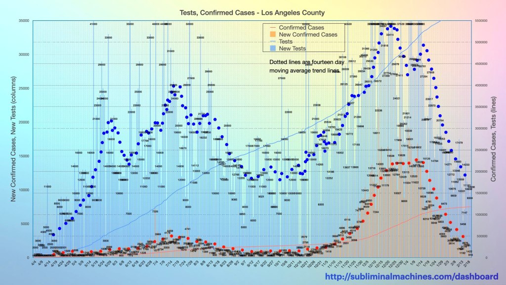
Chart of (cumulative) Tests, and Confirmed Cases, New Tests (column) for Los Angeles County. Trendline (dotted line) is a seven day moving average of New Tests. Read more.

Chart of the death counts from all causes and the death counts involving COVID-19 for Los Angeles County and New York City from February through November of this year.

Chart of the death counts in California from all causes, influenza and pneumonia, involving COVID-19 and COVID-19 underlying for forty week period from February through November of 2020 and 2019.
see more…
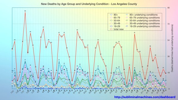
Chart of distribution of New Deaths by Age Group (solid lines) and Underlying Conditions (dashed lines) for Los Angeles County. The dotted line is total New Deaths. See more charts showing demographics distributions by Ethnicity, Income and Gender.

Charts specific to the local beach cities of South Bay Los Angeles showing Confirmed Cases, Hospitalizations, Deaths and Testing.
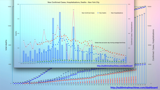
How is Los Angeles County doing relative to New York City? See the comparison charts between Los Angeles County and New York City.
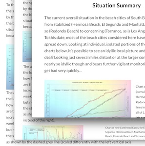
The situation summary provides a brief narrative read that snapshots how Los Angeles County is doing. Alternatively, you can review the charts below in detail at your own pace. There is a separate situation summary that snapshots specifically the South Bay Los Angeles beach cities.

Thanks for looking.
Check back tomorrow
for the latest updates.
Get in Touch…
You can send Subliminal Machines a private message by selecting Contact in the menu at the top of this page or just post a comment below.
Copyright Subliminal Machines – All rights reserved
