Updated for Sunday, February 28th
Description:
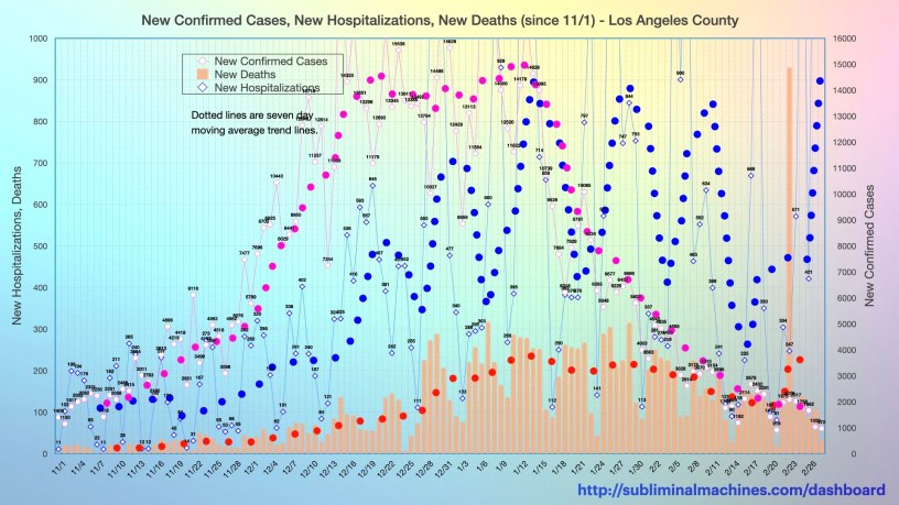
This is a two axis chart that has been redesigned for the purpose of clarity. The magenta line charts the number of new confirmed cases recorded in Los Angeles County each day. The corresponding magenta dotted line is a seven day moving average trend line that smooths out these day to day variations. These lines are vertically scaled with the right axis.
The light blue line charts the number of new hospitalizations each day. The dotted blue line is its corresponding seven day moving average trend line. The light orange columns show the number of new deaths from this pandemic virus each day. The dotted red line is a seven day moving average trend line that smooths out the variations in these numbers from day to day. Both these series are vertically scaled with the left axis.
Note, the chart featured on this page above covers just the dates from November 1st forward for purposes of clarity. The fuller (perhaps less legible but more complete) chart from approximately mid-March is below.
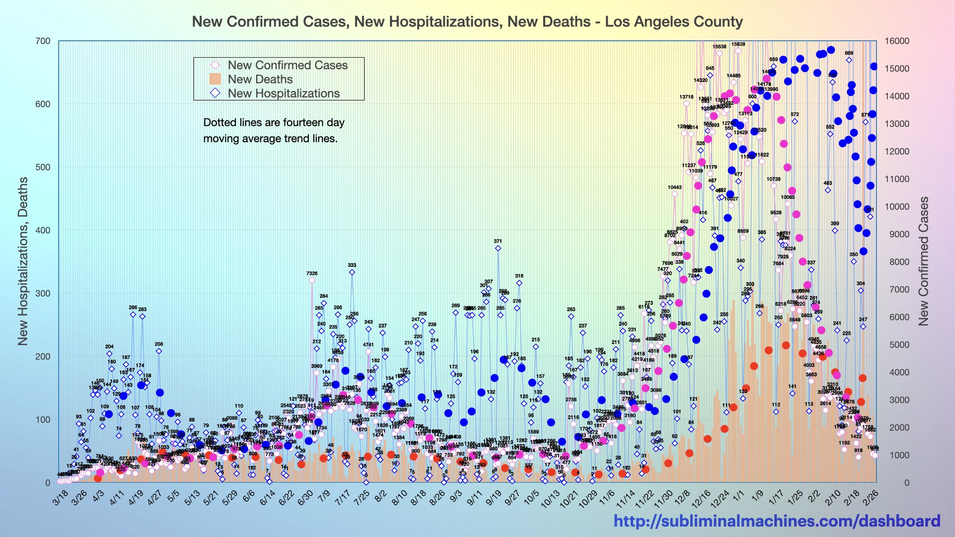
More complete version of the chart featured above, from late-March forward showing new Confirmed Cases, Hospitalizations and Deaths (columns) for Los Angeles County as a whole. Trendlines (dotted lines) are fourteen day moving averages. Read more.
Commentary:
This chart provides an instantaneous snapshot of the current situation in Los Angeles County. While the day to day jumps track the jagged dynamic motions, it is the colour dotted lines of seven day moving average trend lines that tells the story of what is going on.
The dotted blue line charting the hospitalizations shows a major decline over the second half of April and early May before plateauing to roughly the same level ever since. The dotted red line representing the deaths that occurred is also roughly plateaued over this same time period with a slight decrease through June. The dotted green line showing the new confirmed cases had a brief slight dip during the April/May transition and then steadily increasing from mid-May forward.
Overall, the situation for Los Angeles County can still be considered stabilized for now. The recent increases in new confirmed cases are concerning and likely only partially explained by the significant rise in testing. Fortunately, hospitalizations and deaths are plateaued/slightly decreasing. This looks to be a critical (possibly pivotal?) period of time currently…
see more…
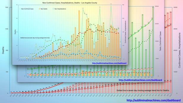
See more charts for Los Angeles County showing Testing, Confirmed Cases, Hospitalizations and Deaths for the county as a whole.

More charts showing demographics distributions by Age Group, Underlying Conditions, Ethnicity, Income and Gender for Los Angeles County as a whole.
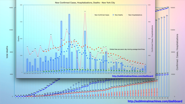
How is Los Angeles County doing relative to New York City? See the comparison charts between Los Angeles County and New York City.
