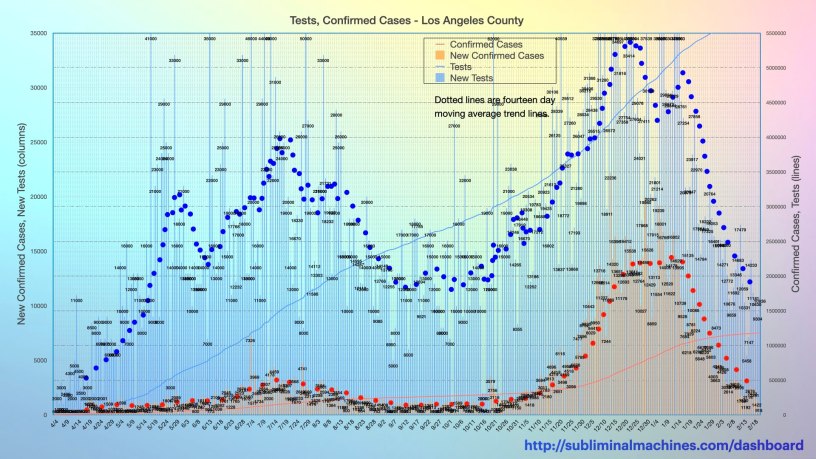
Description:
This is a two axis chart. The solid blue line provides a running tally of the total number of tests for Los Angeles County. The light blue columns show the number of new tests each day using the left vertical axis scale. The dotted blue line is a seven day moving average trend line for these daily new test numbers.
The solid orange line charts the cumulative number of confirmed cases for Los Angeles County. The orange columns indicate the daily number of new confirmed cases, again using the left vertical axis scale. The dotted orange line is a seven day moving average trend line for these daily new confirmed cases.
The data for cumulative tests and confirmed cases both use the right vertical axis for scale.
Charts showing both test counts and rates per 100,000 people are available for the beach cities in South Bay Los Angeles.
Commentary:
As you can see by the seven day moving average trend line (dotted) for the light green columns on this chart, testing is most definitely on the increase from a couple of thousand per day at the start of April to several thousand (or more) each day by the end of the month.
While testing has been significantly increasing (finally), the number of confirmed cases haven’t been proportionately increasing in direct correspondence. This could be interpreted as a sign for optimism…
see more…
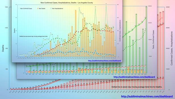
See more charts for Los Angeles County showing Testing, Confirmed Cases, Hospitalizations and Deaths for the county as a whole.

More charts showing demographics distributions by Age Group, Underlying Conditions, Ethnicity, Income and Gender for Los Angeles County as a whole.
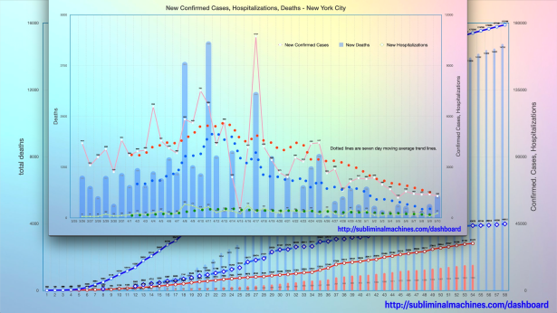
How is Los Angeles County doing relative to New York City? See the comparison charts between Los Angeles County and New York City.
