Updated for Sunday, February 28th
Description:
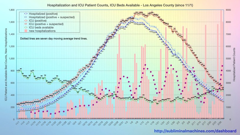
The solid blue line shows the number of positive tested patients in Los Angeles County hospitals each day. The dashed blue line above this, adds the count of hospital patients who are suspected to be positive but not yet confirmed by test.
The solid red line shows the number of positive tested patients in the Intensive Care Units of Los Angeles County hospitals each day. The dashed red line above this, adds the count of ICU patients who are suspected to be positive but not yet confirmed by test. The solid green line indicates the number of ICU beds available at Los Angeles County hospitals. These are all scaled vertically with the axis on the left.
For the purpose of correlation, the pink columns shows the number of new hospitalizations in Los Angeles County each day. The corresponding dotted line is a seven day moving average trend line from these to smooth out the day to day variations. This is also scaled vertically with the axis on the left.
Note, the chart featured on this page above covers just the dates from October 21st forward for purposes of clarity. If you prefer, the fuller (perhaps less legible but more complete) chart from approximately late-July, see below.
Commentary:
The number of positive tested patients in Los Angeles County hospitals each day sharply increases from the start of November forward. The number of patients in the Intensive Care Units of these hospitals can be seen to increase proportionally during this timeframe. The number of available ICU beds at these hospitals has been decreasing substantially.

see more…
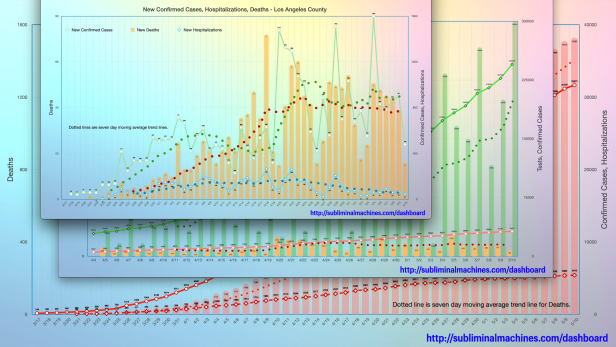
See more charts for Los Angeles County showing Testing, Confirmed Cases, Hospitalizations and Deaths for the county as a whole.

More charts showing demographics distributions by Age Group, Underlying Conditions, Ethnicity, Income and Gender for Los Angeles County as a whole.
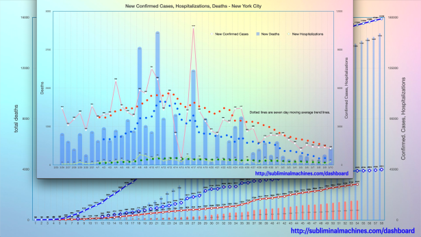
How is Los Angeles County doing relative to New York City? See the comparison charts between Los Angeles County and New York City.
