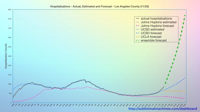
On Thanksgiving Day, November 26th, we posted the chart above which shows a timeline of the number of COVID-19 patients in the Los Angeles County hospitals each day along with the estimates and forecasts of the same from selected (mostly academic) institutions. The dashed green curve is the ensemble forecast which aggregates together all of the individual forecast models (including several which were not charted solely for the purpose of clarity). This ensemble forecast was the most aggressive of the forecasts shown on the chart (by far) and predicted what was surely an unrealistic number of hospitalizations coming in the month of December.
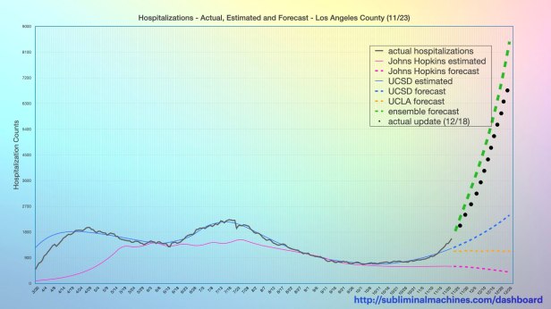
With an abundance of curiosity, we thought it would be an interesting exercise to revisit that chart of forecasts from Thanksgiving Day and update it with the actual numbers of COVID-19 patients in the Los Angeles County hospitals in the days since. In the updated chart shown below, the dotted black line indicates the (extraordinary) increases in the county’s hospitalizations over recent weeks. As expected, the ensemble forecast was overly aggressive in predicting an extraordinary influx of COVID-19 hospital admissions but surprisingly, not by much at all and it was definitively more accurate than the other forecast models shown. In comparison, the ensemble forecast for December 18th predicted 6,130.4 hospitalizations instead of the actual 5,424 count, a variance of about 11.5%. If you think this isn’t close at all, bear in mind this prediction is already substantially more than the peaks of the two hospitalization surges added together!
So now you know. Whom would have thought such an unlikely, unprecedented forecast of hospitalized COVID-19 patients of this magnitude four weeks into the future could be remotely accurate? Perhaps these experts with their predictive models actually know what they are talking about? And if we can accept this, then perhaps we should also stop second guessing the experts and heed their recommendations and public safety orders?
For the record, the chart below shows the forecasts for the next month. Let’s make an appointment to reconvene and re-assess the accuracy of these forecasts in the new year. Any questions?

Many more related charts are available at the dashboard.
